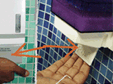
This is a perfect example of lack of proper visual clue to usage of the object. Looking at the soap dispenser such questions can arise - Is it pull or push? Is it to be used single handed or double-handed?
This problem is seen in many types of soap dispensers. There is no proper visual clue to the usage of the dispenser. The user need to attempt pushing the dispenser know at least twice before finding out about getting soap out of it.
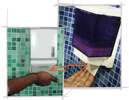
Same product also comes in different types of working, essentially adding confusion to how it works. These different behaviors puts user in quandary. User is left to guessing and finding out by trial-and-error method answers for questions like, Is it pull or push? Is it single handed or double?
In some cases graphics / illustration is provided which shows how to use it even though design is unintuitive. Especially when both the products are used in same premises at two places, it creates lots of confusion for the users. When in rush instead of ‘pulling’, the user tends to push. Moreover, the user tends to push the lid using their fingers leading to wastages of the liquid. Also the simple task of cleaning hands actually becomes secondary issue to primary issue which is getting soap out of the dispenser! Unnecessary pushing-pulling obviously leads to quick tearing-off of the dispenser as well.
|
|
Tweet |


