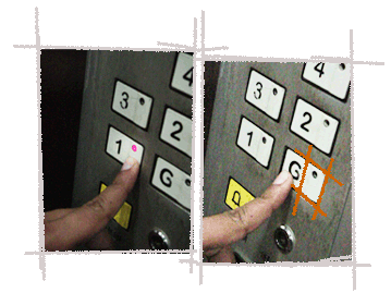
Where to press to make the button is not obvious. Despite the designer’s attempt to re-state “press here” message by raising part of the button surface, people tend to press the larger area with the number rather than the small embossed protrusion. For a first time user, there are always some trials to figure this out. Well meaning design going bad, or a case of over-design?

Big buttons with floor numbers shown on it, where does a person naturally press on this button to use the lift? To press on the big button provided or the small area on the button which has the floor numbers shown on it?
This problem occurs when the area to click to make the lift operational is not clearly demarcated. The button being long, it increases the affordance to press on the larger area rather than on the small representation with floor numbers. This type of lift buttons lead to even more confusion in case of a first time user. The users especially when they are in a hurry tend to press the button and wait for the lift to open. They end up wasting time and after recognizing the process, they re-do the whole thing again. This adds to the problem especially when different lifts are used in a campus based locality where different blocks of buildings use different types of lifts.
|
|
Tweet |


